I’ve taken the criticisms into careful consideration, and here are the latest image updates:
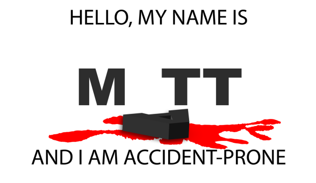
I spent a lot of time figuring out how to use perspective to give the blood spatter a solid “floor,” but the letters felt too flat against that perspective surface. Carl had some input on this, and the end solution was to include a 3D Extrude stylization filter to give depth and dimension to the letter “A”. There is a nice contrast with the flat letters in the background, and a slightly more gray value is applied to the background letters to emphasize this.The blood was given more detail by using the Wrinkle Tool. Overall, this is a pleasing change and I’m much happier with the results than earlier versions.
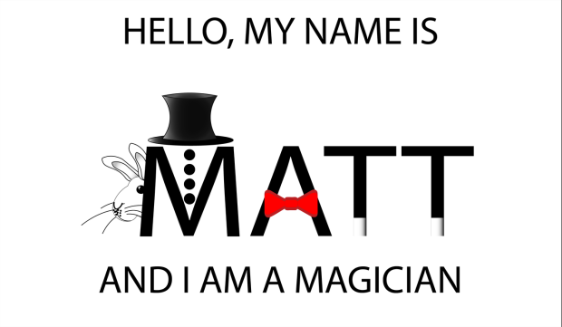
What kind of magician would I be without a rabbit? The peer critique included an earlier, rougher version of this critter, but I’ve refined it to a point where it is a welcome distraction and not just a proof of concept. The sparse grayscale image really Pops thanks to the included red bowtie. This was created as a series of shape (Rectangle Tool) and a thicker brush setting for the outline. A heavy use of Gradient was applied to multiple Layers of the top-hat to give it a more three-dimensional appearance. Abracadabra!
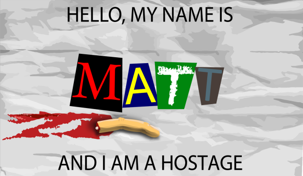
The lion’s share of time went into this third image. Carl had an interesting suggestion to give the background a crumpled paper appearance. I scoured the web for a few options on how to do this. One suggested using a gradient tool in Photoshop and importing that image into Illustrator like so:
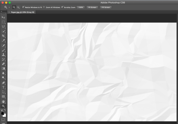
This wasn’t a bad approach, but it didn’t really “look right” in Illustrator. The better solution I found came from a multistep approach involving actual crumpled paper (Read here). I started by crumpling a folded piece of paper, and then scanning a highDPI image of it and saving the PNG for use in Illustrator. I then used the Image Trace tool to assign shapes their corresponding values (4 shades of gray). The end effect was more convincing because it was derived from the genuine object. Next, I created improved letter “clippings” for the ransom note stylization by choosing a variety of fonts and color combinations, grouped with rectangles that were altered using Transform to give them a more natural appearance.
The final steps involved creating a severed finger – because just one pool of blood in a project is never enough. I started with the Rectangle tool and created two segments, for the third segment (the fingertip), I used a pair of Ellipse tool shapes (fingertip and fingernail), which I altered with the Pen Tool. I then used a gradient fill to give the nail some depth, but struggled to find a gradient to give the finger segments an illusion of depth. I decided to hold off on that detail and used a regular color fill from the Skin Tone Library (color swatch). I then rotated the segments to give the finger a more curled appearance, and the Pen Tool to create the creases in the skin.
Solution for creating depth: I layered four stacks of cloned finger (object groups) on top of one another and then used the Eraser to create a gradation of shadows (Stylization and Drop Shadow) to create a rounder appearance. The end effect is consistently cartoonish with the rest of the image.
Finally, I created a “blood soaked paper” effect by changing the fill color of the surrounding Image Trace generated shapes and the Wrinkle Tool to give it a more distressed appearance. The one effect I want but haven’t been able to figure out is how to “crinkle” the ransom note letters themselves. They feel a bit too flat, and out of place, but after a few failed attempts with the Knife Tool to create segments I’ve decided to error on the side of caution. If I come up with a solution by Monday, I’ll be sure to update the results here.